Package Design for Shelf Impact: Custom Solutions
An eye-catching package draws customers in and boosts sales. This article highlights five key design strategies for corrugated box and packaging design that command shelf attention. Each strategy includes practical steps, examples, and estimated benefits to help brands implement custom packaging solutions that stand out in retail.
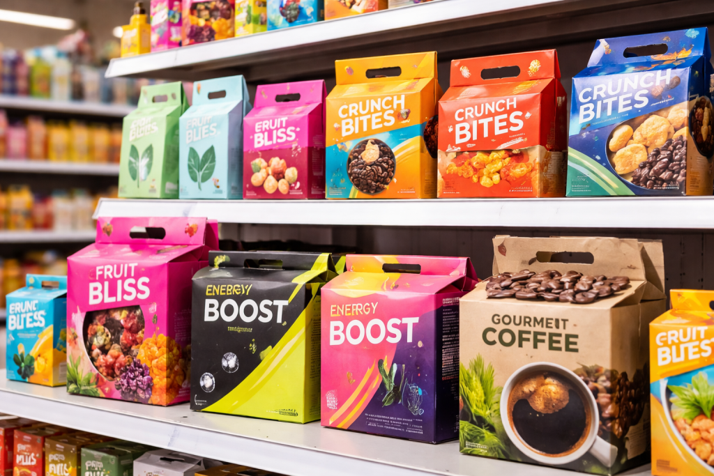
Visual Hierarchy & Bold Color Contrast
Make your package instantly noticeable with high-contrast colors and clear layout. A simple example: use a bright accent color on one panel of a corrugated box to draw the eye, combined with the brand logo and product name in large font at the top. This guides the customer’s focus in seconds. For instance, a snack box with neon yellow graphics on matte black corrugated packaging can jump off the shelf compared to muted packaging. Designing this way may add a minor 5–10% printing cost (estimate), but can boost perceived shelf appeal by 20–30% (estimate). The key is using 2–3 brand colors consistently, and layering finishes (like spot gloss or foil) on logos or key text to enhance prominence.
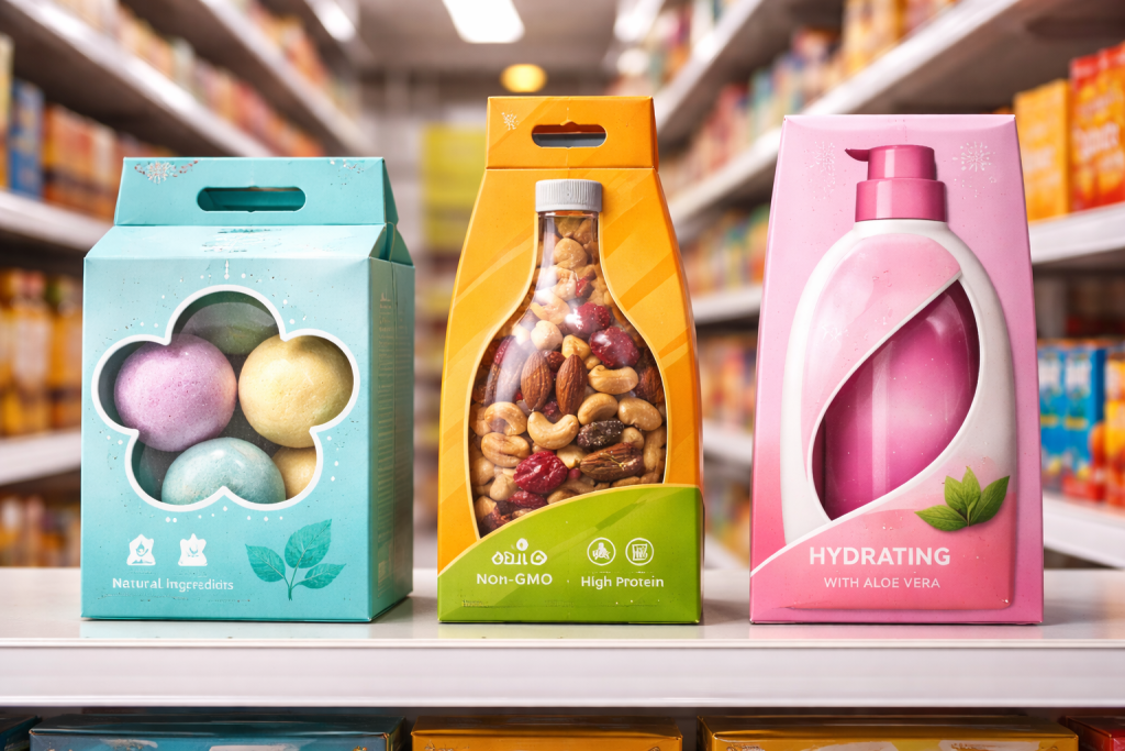
Unique Structural Shapes & Cutouts
Break the clutter of rectangular boxes by innovative box shapes or die-cut windows. Consider a corrugated box with a partial cut-out window or a non-rectangular die-cut panel that reflects the product’s form (e.g., a bottle-shaped cutout for a beverage). This immediately signals product contents and piques interest. For example, a cosmetics line used a trapezoidal flap on its display box – this unique flap shape made the stack of boxes visually dynamic. Creating such custom structures may require tooling setup, which can raise one-time costs, but it adds value. Brands often recoup that through higher pricing (e.g., a premium on-pack of +10% (estimate) due to the distinctive design) and stronger customer recall.
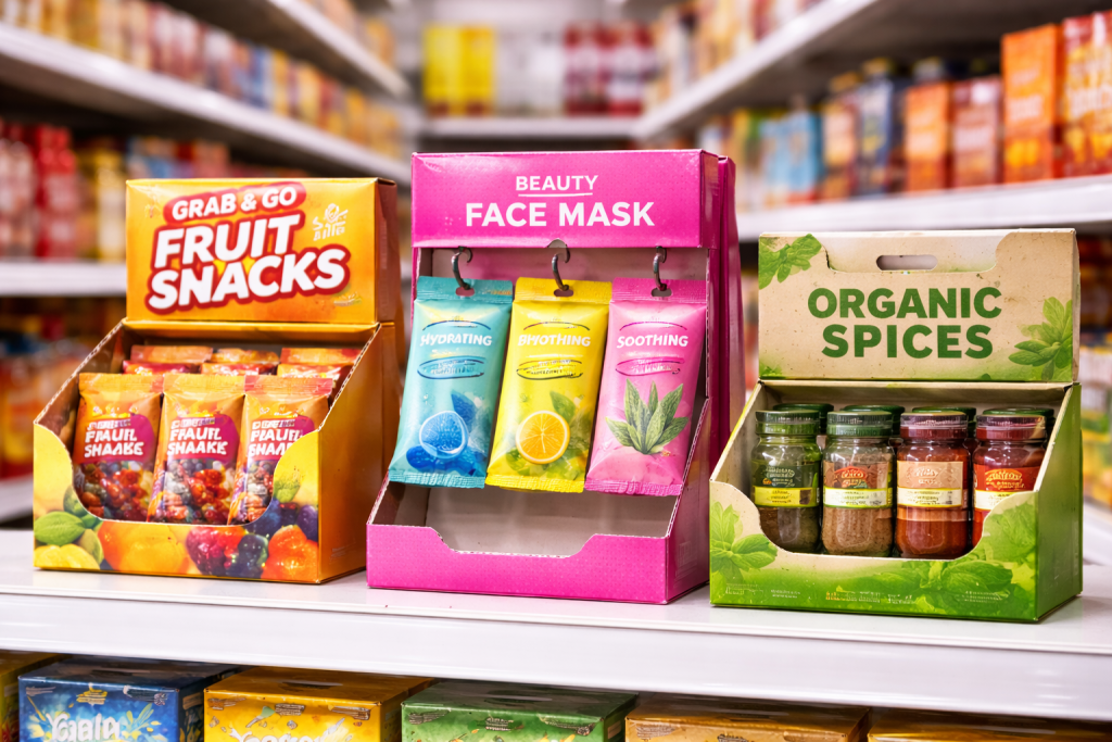
Point-of-Sale (POS) and Modular Display Design
Design packages to work both as individual units and as shelf-ready displays. For instance, a corrugated box could include perforations for a pop-open display front or built-in hanging holes if the retail setting requires pegboard presentation. A practical example: a snack brand designed its case of small boxes to tear off into a countertop display, so no extra shelving needed. Ensure your design aligns with how products sit in stores. When multiple units are placed side-by-side, use a consistent graphic or pattern across adjoining faces so the group looks cohesive (e.g., stripes that align across boxes). Modular design can cost slightly more in design time, but it reduces labor at retail (e.g., up to 50% fewer shelf-restock hours, estimate) and makes restocking easier.
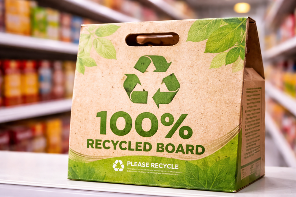
Sustainability Cues and Messaging
Use eco-friendly materials as a visual cue that also tells your brand story. Uncoated kraft corrugated or visible recycled flecks convey green credentials at a glance. For example, a food brand printed a light-green leaf motif and “100% Recycled Board” icon on its corrugated carton. Shoppers now often look for those symbols, so this can improve shelf appeal to eco-conscious buyers by roughly +15% (estimate). On average, recycled corrugated costs about the same as virgin, so you get the benefit of appealing to green shoppers at minimal extra expense. Always include a clear recycling icon or brief tagline (like “Please Recycle”) on the front panel to reinforce the message.
Cohesive Modular Graphics
Make multi-packs or product families visually unified. If your product has several sizes or flavors, design their corrugated cartons so they form a larger image or pattern when placed together. For example, a beverage brand’s bottles used a wavy line design that continued seamlessly across adjacent boxes. This modular approach encourages retailers to display them grouped, making a larger visual impact. The cost is mainly in design alignment, but the payoff is that bulk displays sell faster. Imagine a tower of boxes that looks like a continuous billboard; studies suggest such cohesive displays can lift category sales by 10–25% (estimate) by catching the eye of shoppers walking by.

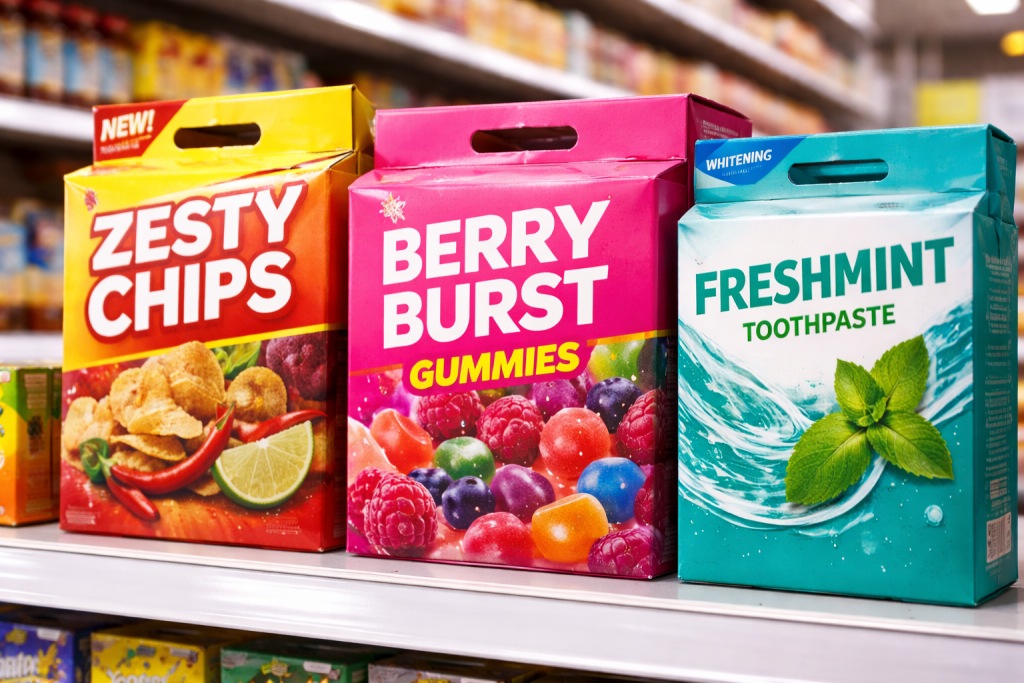
Retail Compliance & Clear Messaging
Ensure the package communicates legally and clearly at first glance. Essential info like UPC codes, weight, or “New!” flags should not clutter the primary shelf face. Instead, reserve a small bottom or side area for barcodes and nutritional info. Use prominent, simple claims near the top front (e.g., “New Formula” or “Eco-Friendly Packaging”). This clarity builds trust quickly. In practice, spending extra creative space on a single call-out (“Made with Organic Corn!”) helps more than long blocks of text. The “benefit per square inch” of packaging is higher when key points are bold and upfront. This doesn’t increase cost – if anything, it avoids compliance headaches – and can reduce buyer hesitation, potentially boosting conversion rates by 5–10% (estimate) in some categories.
Integrate High-Quality Imagery and Finishes
While color and shape grab attention, crisp product photos or graphic motifs reinforce your message. Use images of the product or lifestyle shots on a corrugated sleeve or rigid box lid. For example, a gourmet coffee box featured a glossy photo of beans on matte board, making the product tangible in shoppers’ minds. High-quality printing (like 4-color flexo on corrugated or litho-laminated rigid boxes) may cost more – often +20-30% over basic printing (estimate) – but it conveys premium quality. As a result, perceived value can jump substantially; customers often associate sharper, glossier packaging with a better product experience.
Implementation Checklist:
- Bold Brand Colors: Pick 1-2 vibrant colors and use them consistently for instant recognition.
- Innovative Structure: Add a die-cut window or custom-shaped flap to break shelf monotony.
- Shelf-Ready Design: Include tear-away or hang-tab features for easy display setup.
- Eco-Visible Labels: Show recycling symbols or recycled content visibly on front.
- Unified Graphics: Ensure artwork lines up across multiple boxes for multi-pack displays.
- Clear Front Messaging: Keep only the most critical claims and graphics on the face.
A well-designed package does more than protect – it communicates your brand’s story and value in seconds. By applying these strategies to your corrugated boxes or rigid packaging, you create a memorable impression at shelf. Bold visuals, smart structures, and clear messaging turn ordinary boxes into powerful marketing tools that drive sales.